5 min read
Why the Best Design Systems Are Built on Harmony
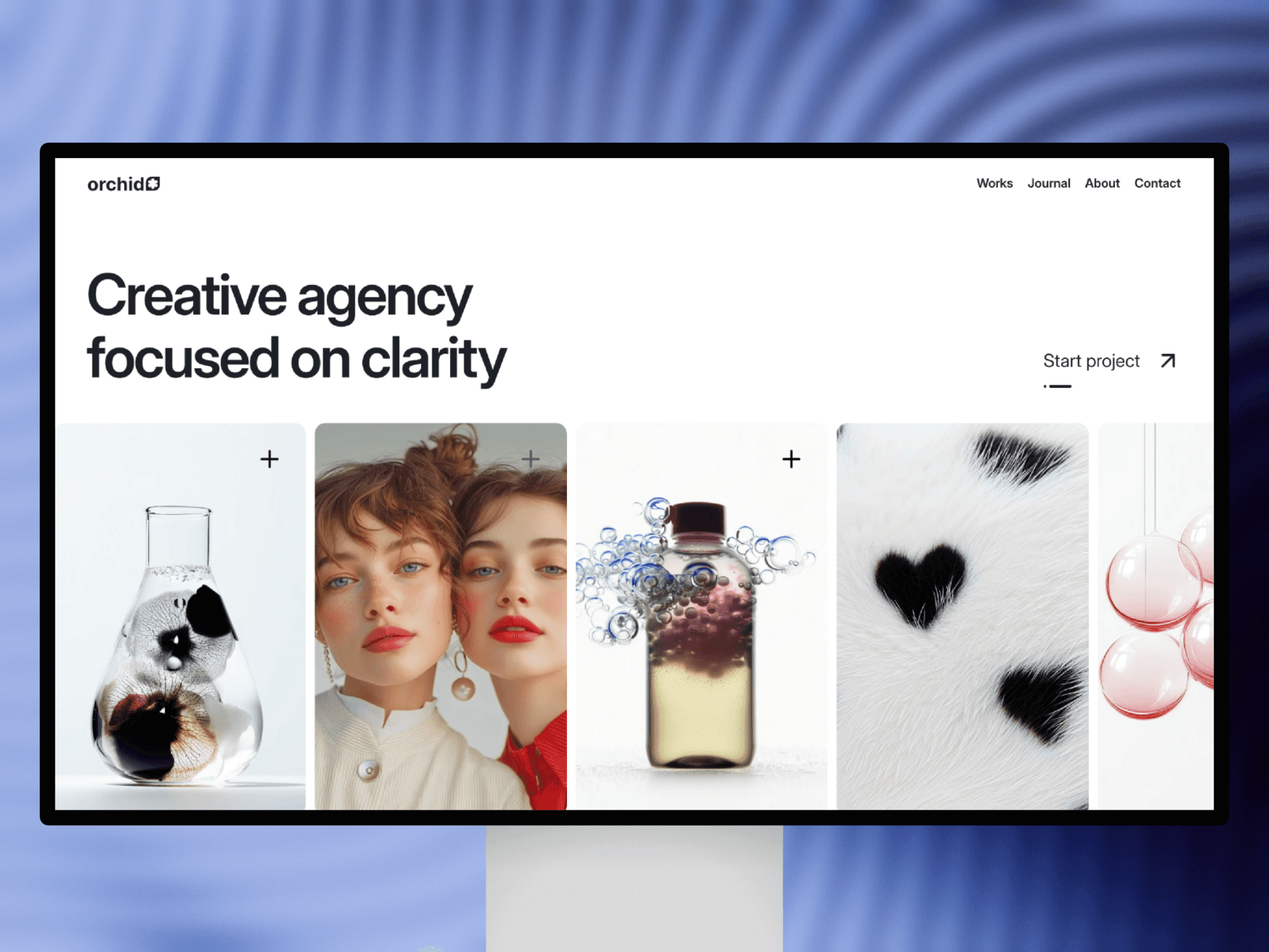
Visual consistency brings trust and recognizability to your designs, helping every 3D asset, UI element, and section feel part of the same story.


Consistency across shapes, lighting, materials, and colors strengthens recognition and builds trust.
Design systems rely on repeating patterns—consistent lighting directions, matching materials, unified geometry, and predictable spacing. When 3D objects and UI components share these qualities, the design becomes easier to use and visually harmonious.
Consistency doesn’t mean sameness. Designers can explore variety while maintaining a coherent foundation. For example, different 3D objects can share the same lighting softness or material texture, making them feel like part of the same family.
Repeating design decisions across marketing banners, landing pages, and campaigns reinforces brand identity. Users subconsciously recognize consistent choices, whether it’s rounded corners, pastel color palettes, or soft shadows.
Maintaining this harmony also speeds up workflows. When your components, palettes, and 3D assets follow a shared system, creating new pages becomes more intuitive. You generate faster, iterate smarter, and deliver polished results with less effort.
Visual consistency is not just a rule—it’s a design advantage that gives your work a distinct, recognizable character.
If you'd like, I can also format these as Framer CMS entries, export them in JSON, or rewrite them to fit your style even more (more cute, more premium, more editorial, more technical).