4 min read
Color Palettes That Build Emotion Into Every Detail
Color defines personality and emotion in design, guiding how users feel and interact while strengthening brand presence and visual cohesion.


Designers use color to shape emotional responses, set tone, and create consistent atmospheres.
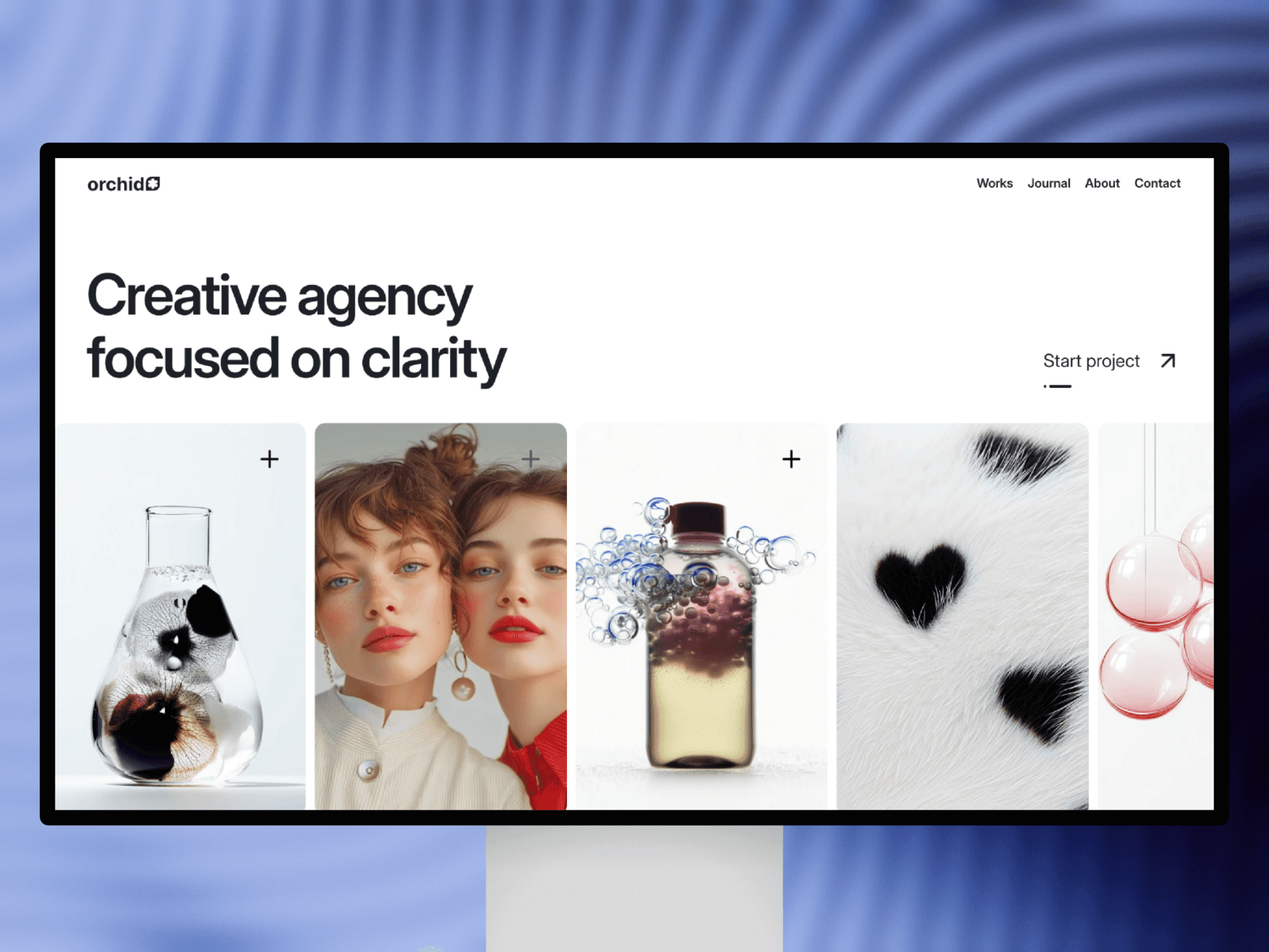
Color choices influence how users perceive a brand before they even process content. Muted neutrals create softness and sophistication, while saturated brights feel energetic and expressive. In soft 3D design, pastel tones enhance approachability and charm, giving objects a friendly, tactile presence.
Gradients add depth to 3D surfaces, especially when combined with subtle lighting. A gentle shift from warm to cool can make shapes feel more dimensional, while monochrome palettes create harmony. Designers often pair a primary color with a restrained secondary palette to maintain consistency.
Colors also communicate hierarchy. Key elements stand out with higher contrast, while neutral backgrounds allow the main content to shine. This balance keeps layouts visually clear and emotionally grounded.
When used cohesively across marketing banners, landing pages, and product visuals, color becomes part of a recognizable visual universe. Designers who understand color atmospheres can guide users through an experience that feels intentionally crafted—calm, bold, or playful depending on the chosen palette.