7 min read
Designing With Materials That Speak a Visual Language
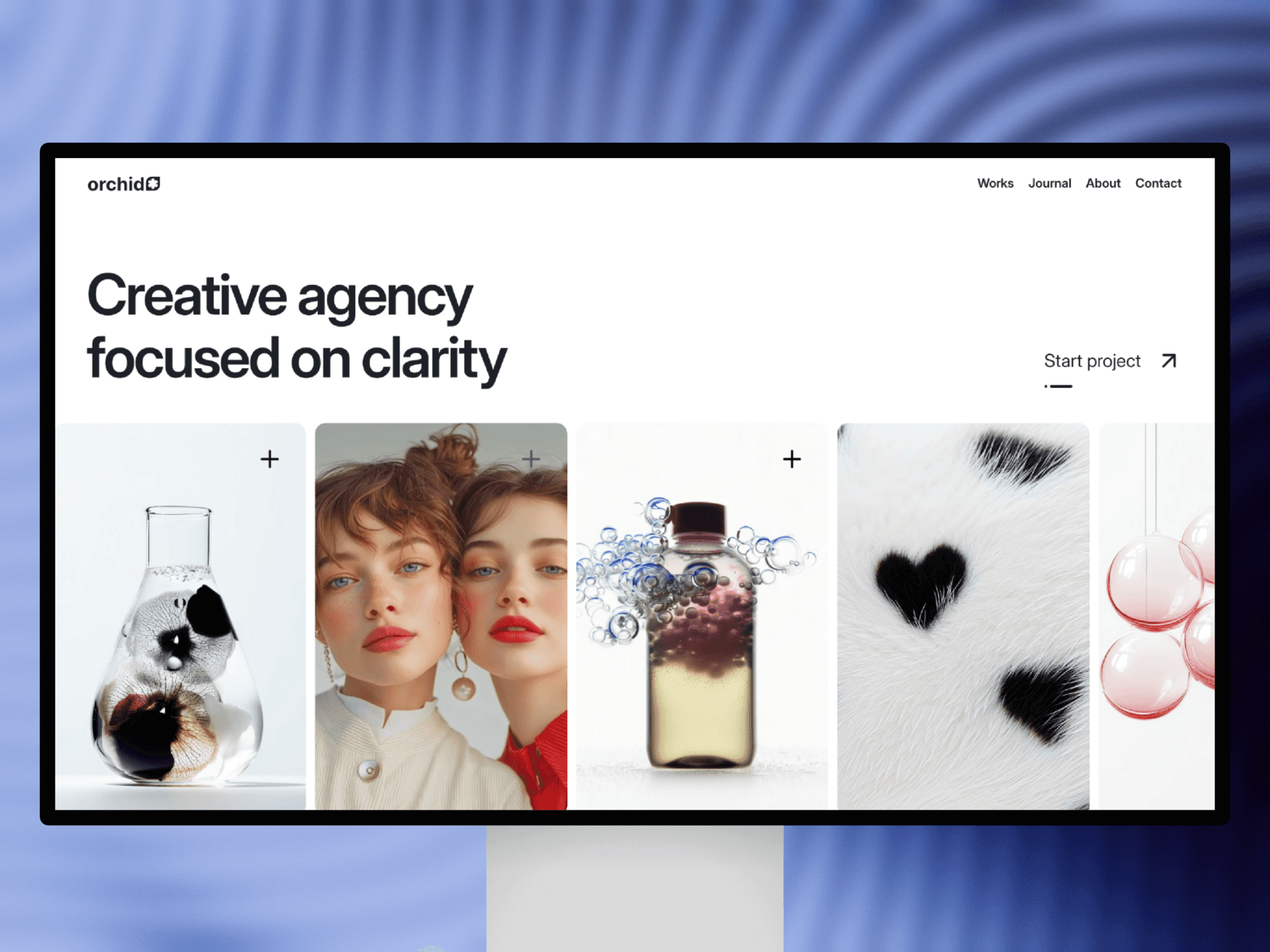
Thoughtful material choices build atmosphere and character in both 3D and interface design, shaping how users interpret mood, depth, and brand values.


In 3D and interface design, the right textures can shift mood, express identity, and guide perception.
Designers increasingly think of materials as narrative devices. Soft, matte surfaces evoke calmness and approachability, while reflective metallics communicate precision and technical confidence. Choosing between these qualities isn’t just aesthetic—it defines how users experience a product, brand, or digital space.
In 3D workflows, subtle roughness, softness, or gloss levels change how an object feels emotionally. A jelly-like surface creates playfulness, while inflatables evoke comfort and lightness. These material variations can become part of a visual identity, allowing brands to be recognized through texture alone.
Material selection also shapes hierarchy. A glossy highlight can guide the eye to important UI elements, while subdued surfaces help secondary components fade into the background. Designers often use contrasting materials in the same scene to balance focus and atmosphere.
When used consistently across banners, landing pages, and product visuals, materials tell a unified story. They give depth to otherwise simple layouts and help designers craft visual universes that feel intentional. Good material work doesn’t shout—it subtly guides users through a richer, more emotional experience.